Analyzing Daily Expenses
20 Dec 2015
ExpenseAnalyzer is a personal project on which I’m currently working. My goal is to build a simple software to analyze my daily expenses: understand how I spend my money, how I can/should change my habits, and check for mistakes in my transactions.
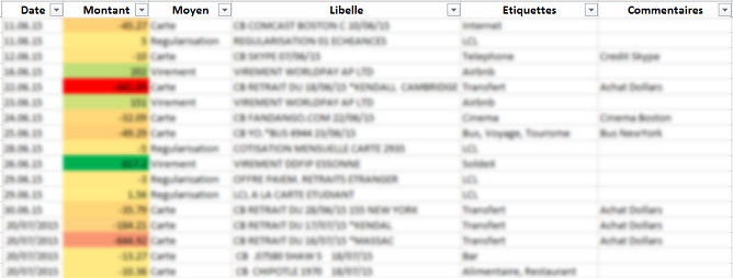
For now, I start with an Excel file built from the downloads of my transaction history. Besides the Data, Amount, and Description fields provided by the banks, I added two columns: Labels and Comments. The first one can contain words like ‘Restaurant’ or ‘Clothing’, while the latter could be ‘Trip to New York’, etc… I started to complete those two new fields by hand, but one of the next things I plan to do is to automate this task.
The following is done in Python, and I am visualizing the results in an IPython Notebook. The first thing I focused on was to cluster keywords (from labels and comments) in order to derive simple insights. To this purpose, I represented these keywords as nodes in a graph, where an edge means that the keywords appeared both in a transaction. Similarities between nodes are computed from the co-occurrences of keywords in the transactions, which gives a pretty nice metric for clustering. This is indeed well suited to an algorithm called Affinity Propagation (check this paper and the implementation in Scikit-Learn).
Below is the graph of all the keywords. It’s a bit hard to read the labels here, but we can at least see what’s happening. Each cluster has its own color, and the bigger a node is, the more money is related to this keyword.
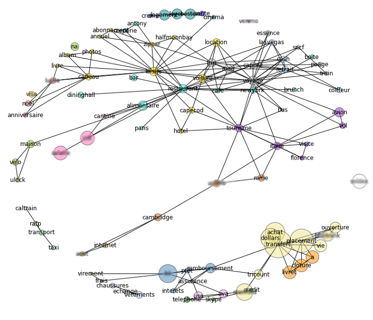
The key here was to consider independently different connected components: keywords from different components have no reason to belong to the same cluster, but the Affinity Propagation algorithm does not prevent two nodes with zero similarity to be clustered together. Also, this algorithms allows us to control the number of clusters by specifying some preference to each node. For this, I used the total amount of money involved in transactions with each keywords.
What is important to understand in my approach is that the clustering is done on keywords and not on transactions. Therefore, a single transaction could have several associated keywords that belong to different clusters. But this is something I wanted, so that I can get the most insight possible from every transaction. For example, a lunch expense could be seen as a restaurant expense, or as part of a trip to New York.
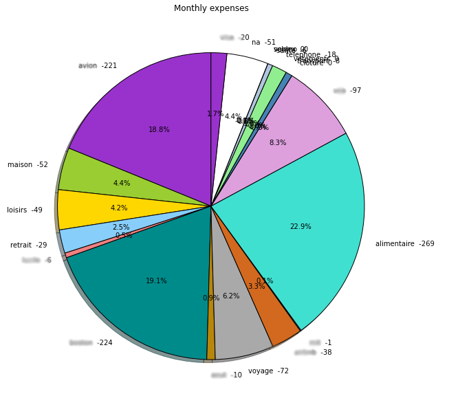
Clustering the keywords was thus the first useful thing to easily see what’s happening. For example, I can now see how my monthly expenses evolves within each cluster, or I can get a rough overview of my average monthly expenses as in the pie chart below (here a singe keyword, smartly chosen, is used to actually refer to a cluster).
Next steps:
- automatic labeling
- more visualization
- automatic conversion when using different currencies
- handling monthly/yearly checks
If you find anything interesting in this project, don’t hesitate to reach out !